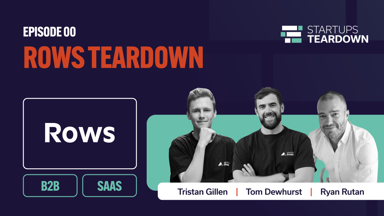
Startup Teardowns: Can Your Product Replace Your Homepage?
Startup Teardowns is our ongoing series where Growth Division founders Tom Dewhurst and Tristan Gillen, alongside Ryan Rutan (Founder at Startups.com), break down how real startups approach growth, product, and positioning in practice.
In our first episode, we take a look at Rows.
Rows sends users straight into the product without any traditional homepage or warm-up. In this Startup Teardown, we unpack when that works, when it doesn’t, and how to decide whether your product is actually ready to replace traditional homepage messaging.
Episode Summary
This teardown explores product-led homepages, why they work for some startups, and why most teams try them too early.
Rows is a bold example, as you land straight inside the product. It can feel magical when you arrive with the right context, and confusing when you don’t.
In this episode, we break down the conditions required for this approach to work: product maturity, user awareness, and instant value recognition.
The Big Idea: The Product is the Homepage
Rows took a bold approach, instead of explaining the product first, they drop you straight into it, so the interface becomes the landing page.
It’s a pure product-led bet that if the product is strong enough, it can do the explaining. That’s an appealing idea, especially in B2B SaaS, where product-led growth has become almost a default aspiration.
But as Tristan points out in the teardown, a product-led homepage only works when certain conditions are met, and most startups try this far too early.
“The homepage becomes the product. But that only works if the product can actually do the explaining.”
The Hidden Dependency: Context
When we landed on Rows’ homepage, we were immediately inside a spreadsheet.
For a cold visitor, that creates friction, but here’s the key insight:
The success of a product-led homepage depends entirely on what the user knew before they arrived.
As Ryan highlights, you can’t evaluate this kind of experience in isolation, you have to understand the journey that led up to it.
If someone has:
- Watched a YouTube walkthrough
- Seen an influencer demo
- Read a use-case breakdown
- Been retargeted multiple times
Then, landing directly in the product feels natural.
But if they arrive cold, it feels abrupt.
“We have to approximate what context the user had before they got here. Otherwise, this experience doesn’t make sense.”
What Rows Gets Right
1. They optimise for the “aha” moment
Instead of asking you to read, scroll, and interpret messaging, they want you to experience value directly.
If you hit a meaningful moment quickly, the product becomes the hook.
As Tom puts it, once that moment happens, the need for traditional marketing disappears. “If I’ve done something meaningful and I don’t want to lose it, I’m hooked.”
And at that point, you don’t need convincing copy, as you’re already sold.
2. They’re betting on distribution over SEO
This strategy suggests they aren’t relying on traditional search-led discovery.
Instead, they’re likely driving awareness through:
- Social
- Influencer demos
- Product content
- Use-case videos
As Ryan suggests, this kind of setup only works if the homepage isn’t your first touchpoint.
In that world, the homepage needs to convert, rather than educate, and that’s a coherent strategy if the channel mix supports it.
3. It’s bold (and boldness can work)
There’s something powerful about removing friction from the path to usage.
If your product is intuitive and immediately valuable, why slow people down with paragraphs?
Where Product-Led Homepages Go Wrong
Most startups see examples like this and think they should just drop people straight into the product.
But as Ryan points out, that’s usually a mistake.
1. Cold traffic needs framing
When someone lands on your site, they’re subconsciously asking:
- Who are you?
- What do you do?
- Is this for me?
- What do I do next?
If the product interface doesn’t answer those questions in seconds, you’ve lost clarity, and clarity beats cleverness every time.
2. Onboarding becomes mission-critical
If the homepage is the product, onboarding becomes marketing. If a user arrives from a marketing use-case page, the onboarding should reflect that.
If they’re a data analyst, show them analyst workflows. If they’re a marketer, highlight ad integrations.
Context must flow through:
- Landing experience
- Onboarding tooltips
- Example data
- Email follow-ups
Without that, the experience feels disconnected.
3. The “aha” must happen fast
A product-led homepage only works if:
- The value is obvious
- The interface is intuitive
- The payoff comes quickly
If your product requires setup, importing data, configuration, or a learning curve before value appears, you’re asking too much.
At that point, explanation is not optional.
The 3 Conditions Required for This to Work
Based on this Teardown, there are three non-negotiables.
1. Product maturity
Your product must be strong enough to stand alone. If someone can’t infer value from the interface itself, you’re not ready.
2. User awareness
The visitor must arrive with context.
That can come from:
- Strong social distribution
- Retargeting
- Educational content
- Influencer demos
If you’re relying on broad SEO traffic, this strategy becomes risky.
3. Instant value recognition
There needs to be a clear, meaningful moment before the signup gate.
Not “I think this could be useful.”
But:
“I don’t want to lose this. Let me sign up.”
That’s the bar.
The Bigger Lesson
The takeaway here is that product-led homepages only work when the surrounding system is strong enough.
When distribution, context, onboarding, and product clarity align, the website can disappear, but when they don’t, you need marketing to bridge the gap.
If you’re considering a product-led approach, or you’re unsure whether your current website is helping or hurting conversion, we’re happy to take a look.
Looking for advice on whether your product is ready to be the homepage? Let’s audit your acquisition funnel together. We can review your channel mix, onboarding experience, and positioning, and identify where clarity (or context) might be missing.
Book your free 30-minute strategy call and let’s break it down properly.
Full Episode Transcript
00:04
Welcome to Startup Teardowns: Marketing Edition, where we pull back the curtain on startup marketing and tell you what’s really working, and what’s not.
I’m Ryan Rutan from Startups.com, joined by Tom Dewhurst and Tristan Gillen, founders of Growth Division and GrowthEX. We’re here to give you the unvarnished truth about the marketing campaigns, landing pages, and email sequences that startups are putting into the world.
Every episode, we dive deep into real examples, dissecting the good, cringing at the bad, and learning from the downright ugly. No sugar-coating, no holding back.
Whether you’re a founder trying to crack the marketing code or a marketer looking to break into the startup space and level up your game, we’re breaking down exactly what separates the campaigns that convert from the ones that crash and burn.
We’ve got a super interesting startup today that hails from Portugal. I live in Lisbon, Portugal, so this is close to home. Honestly, the way they’re approaching their website is already super interesting.
Today, we’re going to go into their homepage and tear it down.
Just to note, Tom and Ryan don’t know who we’re doing this teardown for. I’ve done a little bit of preparation around this, but they have no idea. This is the first time they’re going to find out who we’re tearing down, and they’re going to go into it and wing it.
So, I just went to rows.com, and where am I? I’m inside a product.
Interesting.
So this is the homepage. There’s no landing page. There’s no marketing-type page at all. You’re literally going straight into the product.
First thoughts?
01:34
I’ve got a snap test that I use when I’m looking at a landing page or homepage, which is:
Who are you? Is there a clear brand and category displayed?
What do you do? What’s the plain-English value proposition?
Who is it for? Do I get the ICP at a glance?
Where do I go next? What do I do?
This one, I’m not necessarily going to be able to evaluate on that rubric because we’ve just jumped straight into the page.
Is this exactly what I would see if I arrived for the very first time?
Yes, “Table 1” is up. This is exactly what you would see. You go straight into the table.
There’s some level of familiarity. You know this is some sort of spreadsheet tool. That’s already indicative of what the startup does.
But you’re right; there’s no brand. There’s nothing that screams out what this is exactly about. There’s quite a lot of uncertainty. You basically have to go in and start playing with the tool.
02:31
I’d be interested to see what happens if you Google “Rows spreadsheets”. I’m interested in the user journey, what you would search initially, and then what you land on.
Yes, I wanted to understand the context as well. What do we see before we get there?
Because to your point, the information you have as a user: who it’s for, what it is, isn’t obvious. It’s an interesting user journey to go straight into the product without much context.
If you were referred to it, you’d obviously land on that homepage.
My instant reaction, as someone who’s lived on the internet for a long time, is: okay, it’s Google Sheets, but not, or maybe it’s a better version. That’s what it feels like they’re trying to signal.
As a denizen of the internet, I’d show up with some level of context about what this is attempting to do.
03:27
The obvious pushback here is SEO. We just Googled directly for “Rows”, but if you’re trying to find a shareable spreadsheet, I don’t believe it would be possible to assign enough metadata here for Google to identify what this is.
You kind of have to navigate through onboarding to reach what we’d consider a more traditional homepage.
That would be their actual product page, and it’s super small in terms of links and navigation.
Clearly, they want people to just get into the experience and start using it.
My guess is the magic is in the experience.
Think about your first experience with ChatGPT. There was no preamble, just a blinking cursor and a box that said, “Hey, talk to me.” Eventually, they added some helper prompts because people didn’t know what to say.
Visually, it doesn’t immediately wow. It looks pretty simple. Maybe that’s the point?
When I was playing around with it, I found myself thinking: what do I do? Where do I get data from? What’s my next step?
There’s an AI analyst chatbot on the right-hand side, which seems interesting and tells me a bit more about the tool.
The bit that excited me more was when I saw the data actions. I’ve got all these familiar tools, and I start to understand that this could be useful because I can pull in LinkedIn pages or Facebook pages and get insights.
So this feels like a level up from a traditional spreadsheet or Google Sheet.
That’s the point where I wanted to start playing with it more.
05:10
So much of the value of a page like this, and getting people started quickly, depends on what context they had when they arrived.
If I assume, based on what we saw in Google, that this is a better spreadsheet, that’s one thing. But I didn’t really understand exactly what that meant.
Any time we’re doing marketing, we have to at least try to approximate what the user’s context is coming in.
In a proper marketing funnel, we should know what brought them to this page.
When I see a page like this that feels like a total afterthought, my first assumption is that it’s an afterthought for a reason.
They’re probably not using SEO. They probably assume no one’s going to land on this page first.
They may be driving traffic through YouTube videos, influencers, specific funnels, or maybe even an email course that walks people through steps before they ever land here.
I’ve just checked out their website and social channels quickly, and they do seem to be very active.
So to your point, they’re probably expecting people to see the product in action, through influencers or use-case videos, and then this page kicks them straight into the tool.
That makes this less of a cold experience than what we had.
06:58
When we came back in incognito mode, we did see a welcome experience. There was some onboarding and tooltips, which is good, but it felt pretty generic.
What would be amazing is if that onboarding reflected the context someone arrived with.
For example, if I came in via a highly contextual path, say I’m doing retargeting across three platforms and need to pull in data from all three, the onboarding and examples should align with that.
If they know you’re a marketer, they should promote LinkedIn data, Instagram ads data, and so on.
You’d want email onboarding flows tailored to that experience, too.
You want a specialised, personalised onboarding, both inside the tool and through marketing channels like email.
08:05
When we start with very little context and jump someone straight into a tool, we don’t have much to follow up with either.
So not only is the initial experience watered down, but if nothing in that experience gives additional context, how do we follow up effectively?
Even on the sign-up page, they may be missing a trick. You go from spreadsheet straight to sign-up without really understanding the value of signing up.
Why should I give you my information?
That said, this could be a very bold move, essentially not having a traditional website at all, and using other marketing channels to generate awareness and interest before dropping people into the product.
Looking at their channel mix, they’ve gone heavy on social media and top-of-funnel awareness.
By the time someone reaches the product, they may already be warmed up.
And actually, I like it.
09:18
Here’s where a funnel like this works.
When I’ve done something meaningful in the tool, had a magical moment, and I don’t want to lose it.
I’ve got insights. I’ve structured my data. Something cool has happened.
Then it jumps me to sign-up, and it’s quick. I’m hooked.
The product is the hook.
I don’t need to be chased further. I don’t need to be wined and dined.
But we have to be careful. There is such a thing as being too bold, asking for too much, too soon.
Being bold is fine. Being abrupt is risky.
Overall, though, they’re doing a really great job.
I love the fact that they’re using the product as their homepage. It’s an innovative way of bringing people into the product and giving them a customised onboarding experience.
10:06
Thanks for watching.
Remember to follow on LinkedIn and subscribe on YouTube.
If you have a growth idea or a startup you’d like us to do a teardown of, feel free to comment below or send a DM.
Catch you next time.

TALK TO OUR GROWTH ADVISOR
 TRISTAN ABOUT YOUR OBJECTIVES
Trusted by 130+ startups, scaleups & ambitious SMEs.
Our AI growth operating system and team of marketing experts find you scalable, repeatable channels to market.